Winter isn’t exactly the best time of year for urban sketching, but there’s still one thing I enjoy painting during this season – snow!
Here, you’ll find my general tips for tackling this tricky subject matter with ink and watercolor (Part I) followed by a step-by-step tutorial (Part II) so that you can see how I put these tips into practice.
(PS: Feel free to try out my tutorial for snowy landscapes in your own sketchbook and tag me on Instagram @dannyjhawk)
Part I: General Tips
Before starting a snowy landscape, here are some general tips to keep in mind:
1. Avoid harsh outlines in your composition.
If you enjoy playing around with white space for the contours of your sketch like I do, then I recommend using a pencil – not a pen! – to outline the edges of your snowy landscape so that it has a softer look. (Alternatively, you can sketch to the edge of the page.)
2. Decide on one blue tone and one brown tone as a base.
I always recommend staying away from grey when painting snow (or shadows), since it gives our paintings an unnatural look. Instead, opt for a mixture of blue and brown tones – and stick with it! In my case, I often use ultramarine blue and sepia or Venetian red. (For snow, your mixture will be ca. 4/5 blue and 1/5 brown.)
3. Draw the edges of ridges and snow drifts – but don’t draw the shadows!
This is a big one. A lot of times, people are tempted to draw the shadows they see in snow. Leave this out! We’ll wait to depict shadows until adding watercolor to our sketch.
4. Differentiate between soft shadows and hard shadows.
When it comes to snow, there are two types of shadows we need to differentiate between: soft shadows and hard shadows.
Soft shadows depict changes in elevation or distance and they have a smooth gradation with soft edges (think of a snowy hill that is darker at the bottom and lighter at the top). Hard shadows are caused by objects and, therefore, they have hard edges (think of shadows from pine trees or buildings in the sun).
5. Paint in layers and distinguish between light, middle, and dark tones.
I often paint wet-on-dry, which means my first layer is completely dry before I add the second wash (exceptions to this are things like skies, clouds, and water). This gives me more control over my watercolors, and my sketches also get more contrast.
When it comes to snow, try dividing your entire “white area” into three segments: light tonal values (which are left unpainted), mid tones (which will have one wash), and dark tones (which will have two washes and are the darkest areas – or shadows – of our snow).
Part II: Step-by-Step Snowy Landscape
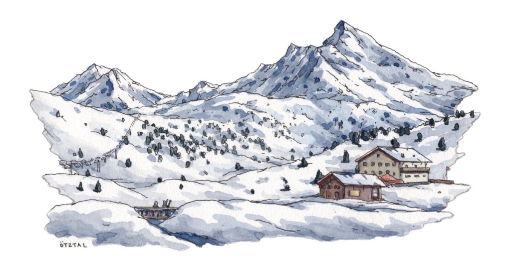
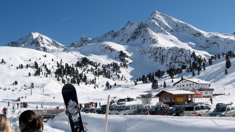
Now it’s time to put these tips into practice using the reference photo below from a skiing trip to Austria.
Step 1: Pencil Sketch & Composition
I usually start my sketches with a rough pencil sketch, since this helps me decide on composition (I prefer not to paint all the way to the edge of the paper, because I want enough white space for my sketches to “breathe”). In this stage, I’m deciding on outlines and borders. Of course, you can also jump right in with ink if you want.
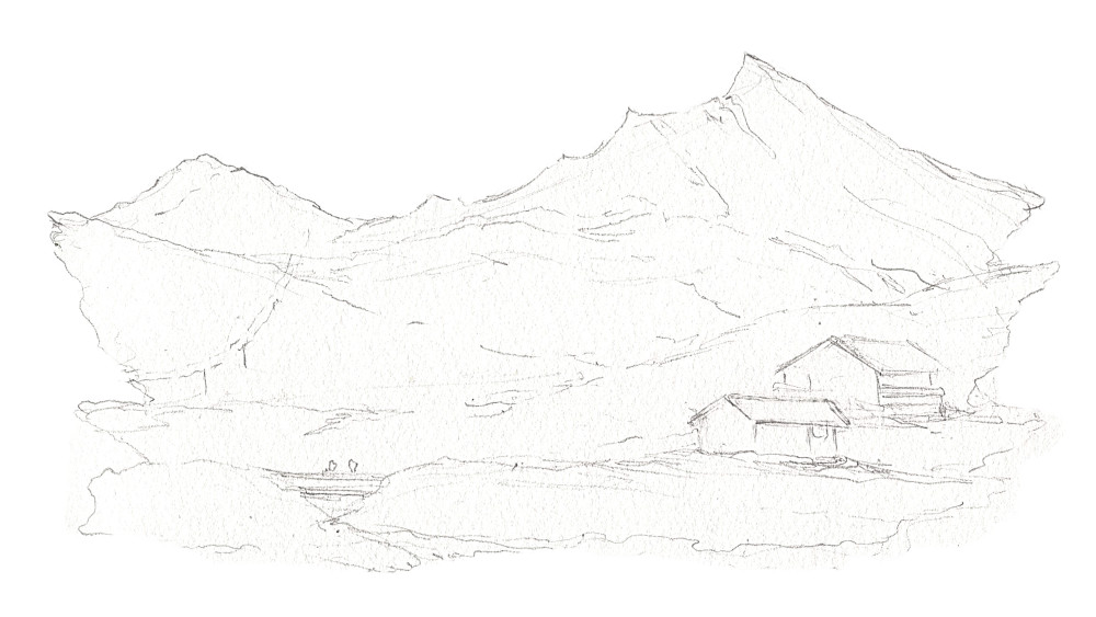
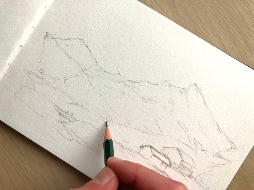
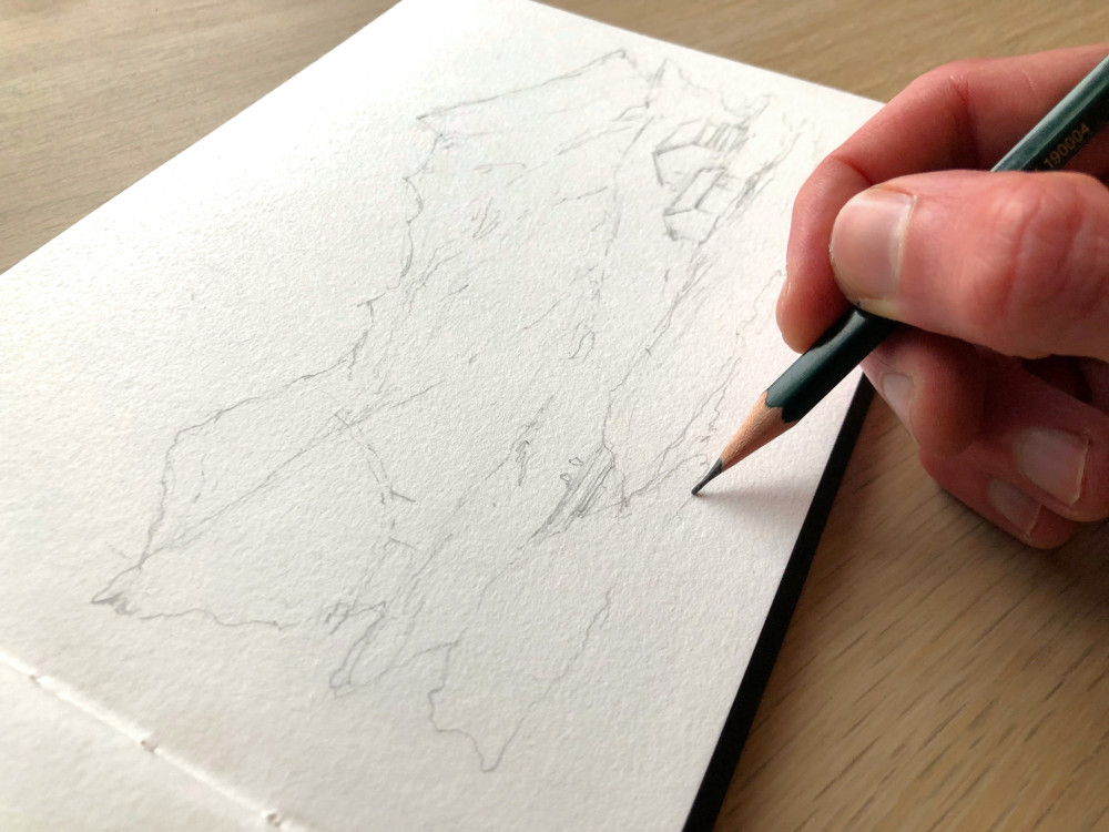
Tip: Don’t get too detailed with your pencil sketch, since we’ll be going over this and adding more details with ink.
Step 2: Inking & Initial Textures
For inking, you can either use a fineliner with waterproof ink or a fountain pen (also with waterproof ink). I prefer the latter, since it gives me more fluid lines and I can use the back of the nib to draw even finer lines.
Important: If you use a fountain pen, make sure your ink is specifically tailored to fountain pens, otherwise your pen will get clogged and ruined – so no India ink! (You can see what supplies I use here.)
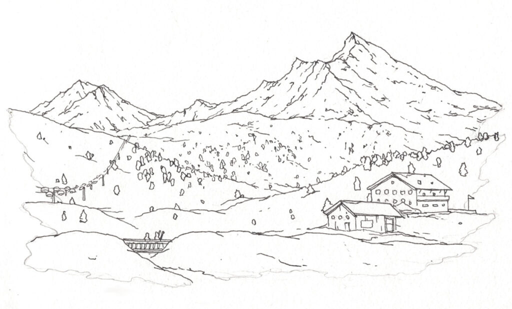
In the inking stage, I’m focusing on basic shapes and textures – e.g., the mountain ridges, hilltops, short and scraggly lines for stones in the mountains, and rough outlines for the trees. Do NOT draw the shadows in the snow or the inside part of the trees – we will get to this later. Note that I am also not inking the outlines on the edge of my sketch (left, right, and bottom), since this could look too harsh at the end.
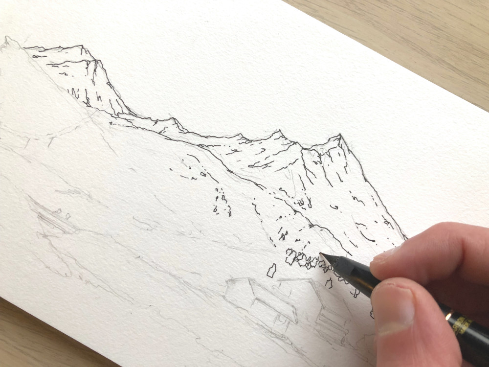
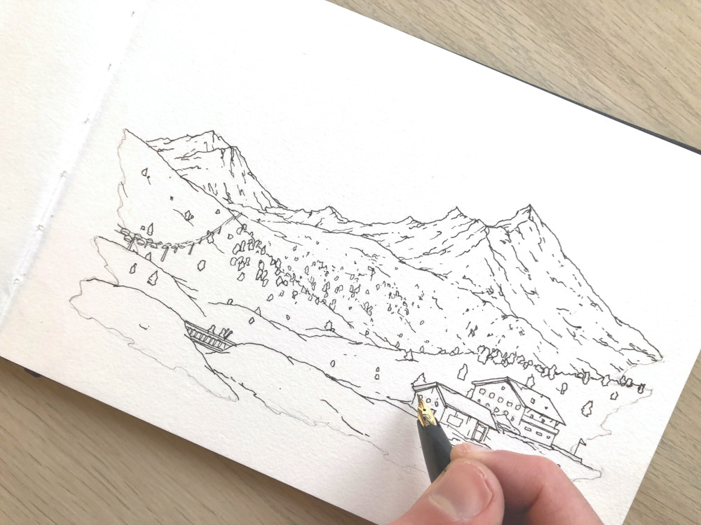
Also, make sure you account for depth by making the trees in the foreground larger than the trees in the background. This makes a big difference!
Step 3: Color, Contrast & Shadows
After inking, I erase my initial pencil sketch and then start adding watercolors. For snow, first determine the lightest part of your subject. These are the areas where the sun is reflected by the snow. We will leave these areas unpainted.
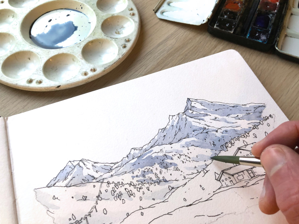
Instead, we’ll start by painting the mid tones – so everything where shadows start – with a mixture of blue and brown. For soft shadows (e.g., the hill on the left), I’ll take some moisture off my brush with a paper towel and then smooth the edges. For harsh shadows (e.g, the snow drift in the foreground, the shadows on the mountains), I can leave the edges rough. Notice the difference in the photo above between the shadows on the left and the shadows on the right.
After painting the mid tones, your sketch should look something like this:
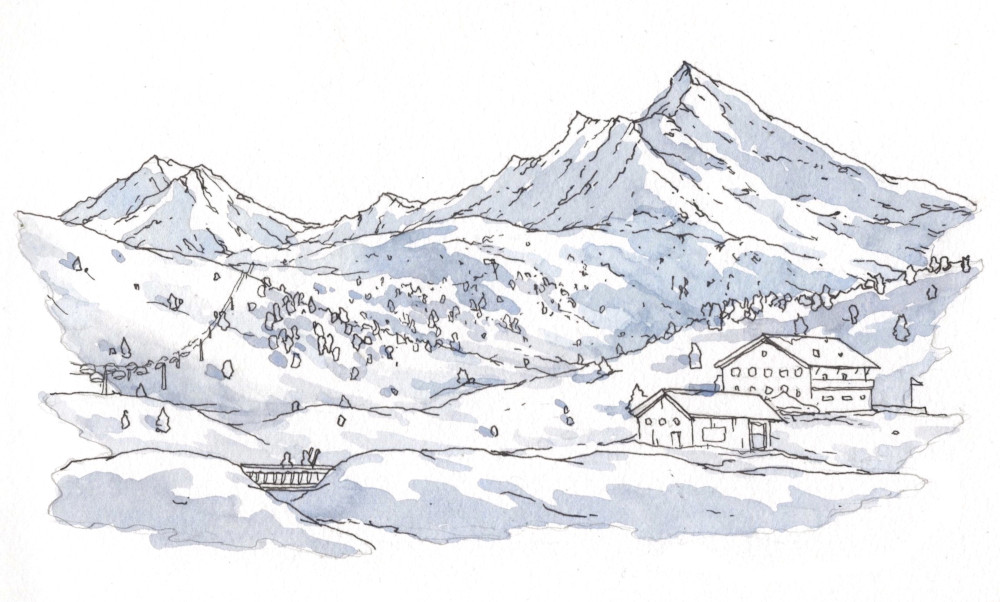
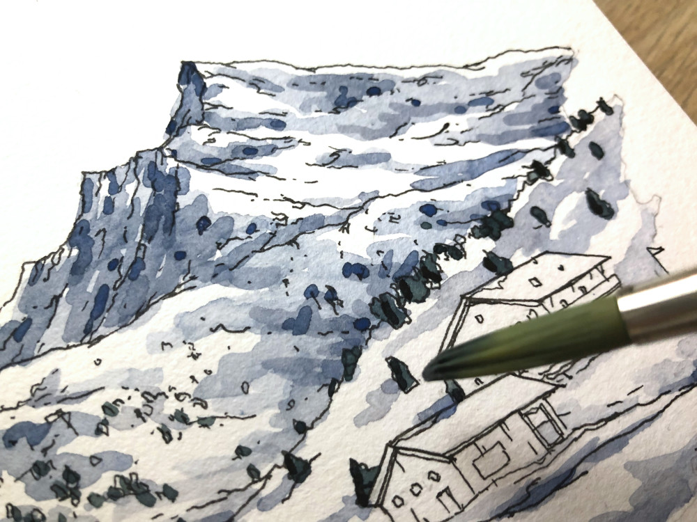
Once our first wash is completely dry, we can add a second dark blue wash in those areas where the shadows are particularly dark. Make sure you wait until your initial wash is no longer cool to the touch. Since the light is coming from the right, the areas on the left of the mountain ridges and hills will be darker.
PS: Be careful that you don’t cover your entire first wash. We want some of the mid tones to be visible!
At this point, we can also start painting the trees with a dark green and blue mixture (you can also add a bit of brown to your mix if you want a more subtle hue).
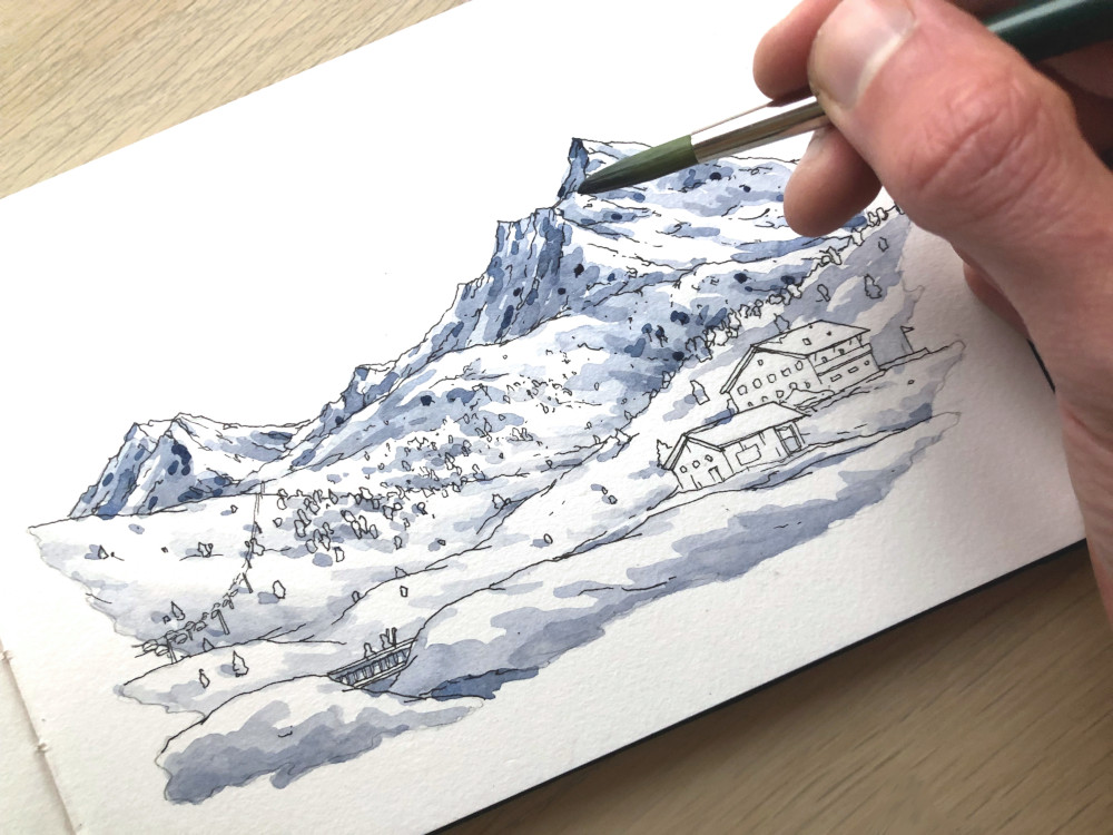
Once this is done, all we have left are the Alpine houses. In this case, I’m using a mixture of yellow ochre and sepia for the house on the right, and Venetian red and sepia for the house on the left. Again, pay particular attention to the lighting. Here, I’ll paint the entire area in one wash, wait for it to dry, and then paint the darker areas (e.g., the left side of the houses) with a second layer.
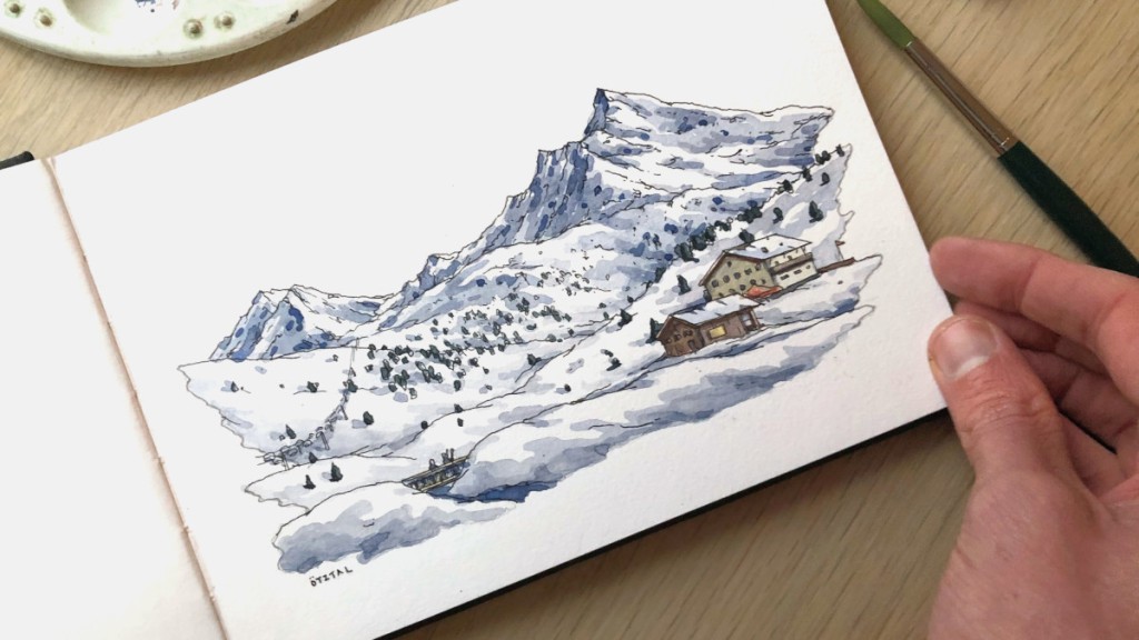
Et voilà, we now have clearly defined light, middle, and dark tones. And with that, our snowy landscape with ink and watercolor is done!
Want more content or even live and personal feedback? Check out one of my online courses or workshops.